
A real audit, published as a sample
Sample accessibility audit report: Shopify’s Dawn demo store
A small, real audit of Shopify’s public demo store for its Dawn theme, run the way AccessComply runs a paid audit. We tested four page types and the mobile menu by keyboard, in the browser’s accessibility tree and by eye, on top of an automated scan. It is a sample, not a full audit of the store.
Tested on 10 November 2026, 16:45 to 18:15 UTC.
- failures against WCAG 2.2 Level A or AA
- 14
- advisory notes
- 4
- passes worth stating
- 19
- page types tested, and the mobile menu
- 4
Scope
What we tested and when.
- Site
- https://theme-dawn-demo.myshopify.com/, theme Dawn 15.0.0, the store’s published theme.
- When
- 10 November 2026, 16:45 to 18:15 UTC.
- Pages, all reached from the home page’s own links
- Home page.
- Collection page "Bags" (header menu: Bags, then Shop all).
- Product page "Louise Slide Sandal" (featured collection on the home page).
- Cart: this store opens a cart pop up after Add to cart instead of a drawer, so we tested the pop up and then the cart page (header cart icon).
- Mobile menu at 390 wide.
- Widths
- 1280 by 800 and 390 by 844 CSS pixels for the keyboard and accessibility tree passes; 320 wide for reflow; 640 by 400 at device scale 2 for 200% zoom (what a 1280 by 800 window shows at 200%).
- Tools
- First the AccessComply production scan, which covered 10 of the 123+ pages it found and reported 3 issues. Then key presses sent by our tooling to a real Chrome browser, with no mouse; the browser’s accessibility tree; our own axe-core runs on the four pages, as loaded and with menus, search, the country selector, the filters and the drawers open; and checks by eye.
- What we touched
- We opened menus, drawers, filters and the search overlay.
- We added one product (Louise Slide Sandal, Gummy, size 40) to the cart once.
- We never entered checkout, never logged in and never changed the cart after that.
- We sent no form. The newsletter field was tried empty and with an invalid value only, and the browser stopped both.
Findings
14 failures, each with its fix.
14 failures against WCAG 2.2 Level A or AA, 4 advisory notes, and 19 passes worth stating.
Critical0
None
Serious1
F01
Moderate8
F02, F03, F04, F05, F06, F07, F08, F09
Minor5
F10, F11, F12, F13, F14
By method: 6 from the keyboard pass, 6 from the accessibility tree, 1 from the visual pass and 1 from the scan. 11 failures are confirmed and 3 are likely (F04, F09 and F14). Each finding names who can fix it: the theme, the store’s own content, or Shopify’s platform code.
| Finding | WCAG criterion | Page | What fails | Fix | Method and confidence |
|---|---|---|---|---|---|
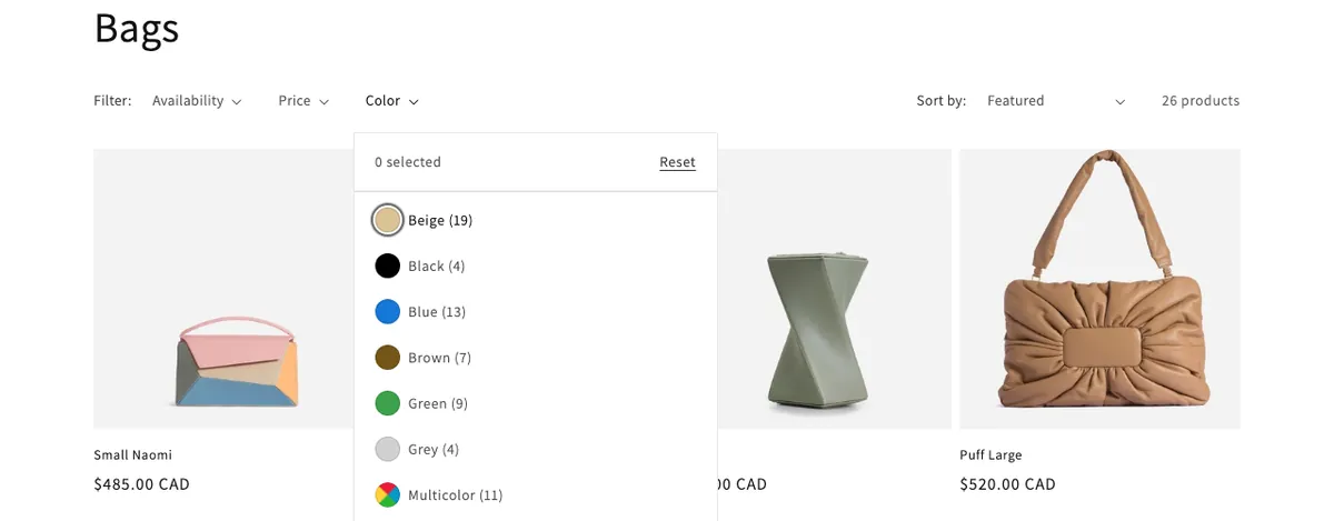
| F01SeriousTheme | 4.1.2 Name, Role, Value (also 2.5.3 Label in Name), Level A | Collection/collections/bagsAt 1280 by 800 | Each colour filter checkbox is named with a raw ID: the accessibility tree reports 'gid://shopify/Metaobject/69546672217' for the box shown as 'Beige (19)'. The visible colour name is marked aria-hidden, and the visually hidden 'Beige (19 products)' text beside the box is not tied to the checkbox, so the name comes from the ID in the swatch label's title.What we measuredThe accessibility tree names the first 8 colour checkboxes (the 8 we read) with IDs of the form gid://shopify/Metaobject/<number>, while their visible text is Beige, Black, Blue and so on. All 12 swatch labels carry such an ID as their title, and axe-core 4.13 run with the Color filter open reports rule 'label' on all 12 checkboxes. A scan of the page as it loads cannot see this because the filter panel is closed. | In the collection filters section, put the colour name inside each swatch label (or point the checkbox at the existing visually hidden 'Beige (19 products)' text with aria-labelledby) and use the colour name, not the ID, in the label's title. | Accessibility treeConfirmed |
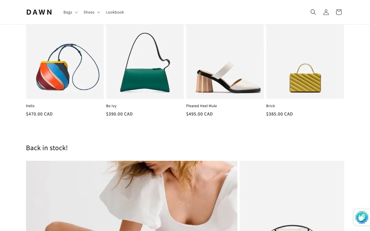
| F02ModerateTheme | 2.4.11 Focus Not Obscured (Minimum), Level AA | Home page/At 1280 by 800 and 390 by 844 | Moving backwards with Shift+Tab, the sticky header slides back in and covers the whole visible part of the focused card, so focus cannot be seen: the four first row cards in the featured collection and the Shoes collage card at 1280 wide, and the Bags collage card at 390 wide.What we measuredAt 1280 by 800 the focused card's focus box spans y -286 to 65 and the header y 0 to 85, leaving 0 square pixels of the focused card uncovered; Shoes collage card y -351 to 68. At 390 by 844 the Bags collage card spans y -309 to 35 under a header at y 0 to 65. Reproduced on the first Shift+Tab pass up the page in two fresh runs; on later laps the card's bottom edge can end a few pixels below the header. On the collection page the same header covers about 87% of the focused card but not all of it. Also seen: collection (focus about 87% covered, not entirely). | In the header section, keep focused items clear of the sticky header, for example with scroll-padding-top on the html element equal to the header height (the theme already sets --header-height there), or turn the sticky header off. | KeyboardConfirmed |
| F03ModerateTheme | 2.4.7 Focus Visible, Level AA | Product page/products/louise-slide-sandalAt 1280 by 800 | The product information column is sticky and taller than the window, so when Tab reaches the Materials and Shipping & Returns toggles they stay below the bottom edge of the window and the focus cannot be seen.What we measuredWindow 800 pixels tall. Product information column: position sticky, top 30px, height 1059 pixels. With focus on Materials its top edge is at y 877; with focus on Shipping & Returns at y 928. Same values in two fresh runs. | In the product information section, turn off sticky content on desktop, or make the column sticky only when it fits in the window, so the browser can scroll focused controls into view. | KeyboardConfirmed |
| F04ModerateTheme | 2.4.7 Focus Visible, Level AA | Product page/products/louise-slide-sandalAt 390 by 844 | On narrow screens the gallery's 'Open media' buttons have no size, so when Tab moves to photo 2 the slider keeps showing photo 1 and only the edge of the focus ring shows at the screen edge; photos 3 to 8 lag one slide behind in the same way, and Enter opens a photo that is not the one on screen.What we measuredFocused button 'Open media 2 in modal' is 0 by 0 pixels at x 376; its slide spans x 375 to 731 in a 390 pixel window (4% on screen); the slider counter reads 1/8. Same pattern for photos 3 to 8 in two fresh runs. | In the product media gallery, make each 'Open media' button cover its whole slide (for example position absolute with inset 0) so the browser scrolls the focused photo into view. | KeyboardLikelyThe behaviour is reproduced; a thin edge of the ring is technically on screen, which we judge is not a usable focus indicator. |
| F05ModerateTheme | 4.1.2 Name, Role, Value, Level A | Home page/At 1280 by 800 | When the footer Country/region selector is open, its search box is a combobox with no expanded state and with aria-owns and aria-controls pointing at an id that does not exist (country-results); the header and footer copies of the selector also repeat the same ids.What we measuredaxe-core 4.13 with the selector open: aria-required-attr (aria-expanded missing on role combobox) and aria-valid-attr-value (aria-owns="country-results"). document.getElementById('country-results') returns null. 22 ids appear twice, among them country-filter-input and every country link. Both labels for the filter point at the first, hidden copy. Also seen: menu (the same selector markup sits in the mobile menu drawer; not opened there). | In the footer and header country selector, give the filter input aria-expanded, point aria-controls at the list that really holds the countries, remove the broken aria-owns, and make the input and list ids unique in each copy. | Accessibility treeConfirmed |
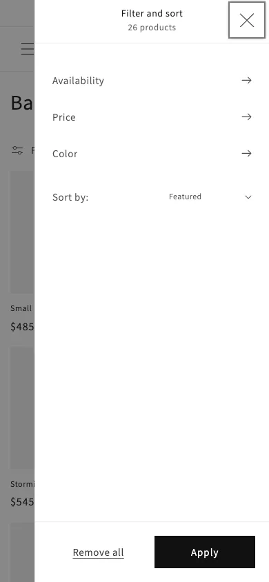
| F06ModerateTheme | 4.1.2 Name, Role, Value, Level A | Collection/collections/bagsAt 390 by 844 | In the mobile Filter and sort drawer, the close (X) control is a focusable span that the accessibility tree reports with role generic and no name, so assistive technology is given no name or role for it.What we measuredFocused element <span tabindex="0" class="mobile-facets__close"> is the first Tab stop in the open drawer, 44 by 44 pixels, visible; accessibility tree: role generic, name empty, focusable. Enter closes the drawer. Same in two fresh runs. | In the collection filters section, make the close control a button with a name, for example <button type="button" aria-label="Close filters">. | Accessibility treeConfirmed |
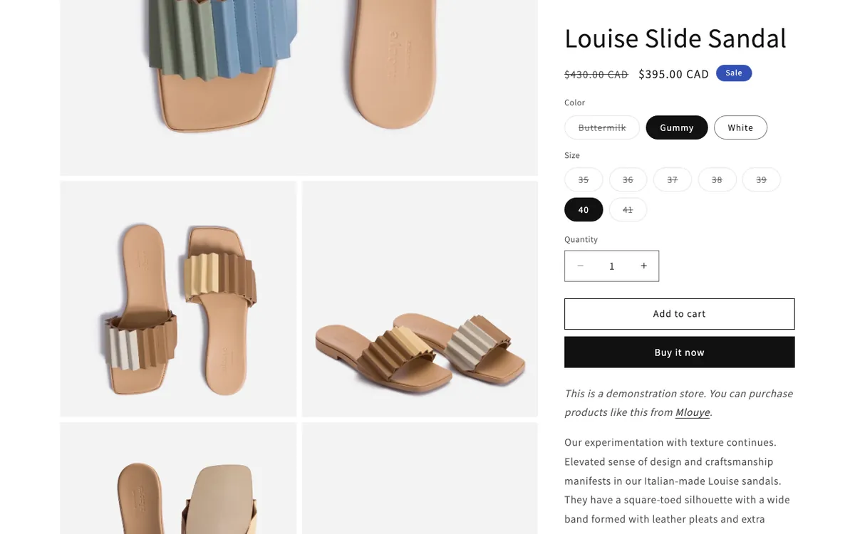
| F07ModerateContent (the store’s text and images, not the theme) | 1.1.1 Non-text Content, Level A | Product page/products/louise-slide-sandalAt 1280 by 800 | All 8 photos in the product gallery have empty alt text, so the accessibility tree skips them and the colours and angles they show are not described to people who cannot see them.What we measuredalt="" on 8 of 8 gallery images (Gummy, Buttermilk and White photos); the accessibility tree ignores them. By contrast the product card images on the home page carry the product name as alt text. | Content: add a short description to each product photo's alt text in the product's media in the Shopify admin (for example 'Louise Slide Sandal in Gummy, seen from above'). | Accessibility treeConfirmed |
| F08ModerateContent (the store’s text and images, not the theme) | 1.1.1 Non-text Content, Level A | Home page/At 1280 by 800 | The Cut logo above the second press quote has empty alt text, so the accessibility tree ignores it and the quote has no source, while the Refinery29 logo beside it is named.What we measuredRefinery29 logo: role image, name 'Refinery 29'. The Cut logo: alt="", ignored by the accessibility tree. The text under it is only the quote and does not name the publication. | Content: give this logo image the alt text 'The Cut' (Content, Files in the Shopify admin, or the image setting in the multicolumn section). | Accessibility treeConfirmed |
| F09ModerateContent (the store’s text and images, not the theme) | 1.1.1 Non-text Content, Level A | Blog article/blogs/news/introducing-stormiAt scanner default | The scan found an image in the 'Introducing Stormi' article with no alt attribute, so assistive technology may read out its file name instead of a description.What we measuredAccessComply scan 5a031a53-5e7c-47e2-b515-b84c2da62dcc, rule image-alt, 1 element. Not rechecked by eye: this page is outside the pages tested by hand. | Content: if this image is part of the article body (its inline style and width '1024x1024' suggest the blog editor), add alt text to it in the blog post editor; confirm on the page whether it comes from the article or from theme code. | Automated scanLikely |
| F10MinorTheme | 1.4.3 Contrast (Minimum), Level AA | Home page/At 1280 by 800 | The tagline 'Atypical leather goods' in the home banner is 16 pixel regular text in 75% white over a photo, and its contrast against the photo under it is about 4:1, below the 4.5:1 that text of this size needs.What we measuredText colour rgba(255, 255, 255, 0.75), banner overlay black at 0.4. Sampled under the text (x 560 to 718, y 658 to 687) with the text hidden: contrast between the blended text colour and each background pixel runs from 3.8:1 to 6.05:1, median 4.03:1, with half the pixels below 4.5:1. Same result in a second fresh run. The heading above it (52 pixels, large text) is at least 3.03:1 against the 3:1 it needs, and 'Shop now' at least 5.57:1. Automated checks cannot measure text over a photo, so neither scan reports this. | In the image banner section, raise the image overlay opacity above its current 40%, show the text on a container, or set the tagline to full white, so it reaches at least 4.5:1 against the photo. | By eyeConfirmed |
| F11MinorShopify platform code, not the theme | 2.4.7 Focus Visible, Level AA | Home page/At 1280 by 800 and 390 by 844 | After the shopper focuses the newsletter field, Shopify's form protection badge adds hCaptcha 'Privacy' and 'Terms' links that take keyboard focus while they sit off screen to the right, so two Tab presses at the end of every page show no focus.What we measuredIn a 1280 pixel window the focused Privacy link is at x 1292 to 1329 and Terms at x 1341 to 1371; at 390 wide they are at x 402 and x 451. Badge container: position fixed, left 1224px. Seen on the home, collection, product and cart pages. Also seen: collection; product; cart. | The badge comes from Shopify's form spam protection, not the theme: report it to Shopify Support; meanwhile a theme stylesheet rule can bring the badge on screen while one of its links has focus (#shop-hcaptcha-badge-container:focus-within). | KeyboardConfirmed |
| F12MinorTheme | 4.1.2 Name, Role, Value, Level A | Product page/products/louise-slide-sandalAt 1280 by 800 | At quantity 1 the 'Decrease quantity' button is drawn at half opacity with a not allowed cursor, so it looks disabled, but the accessibility tree reports an ordinary enabled button.What we measuredButton class 'quantity__button disabled', computed opacity 0.5 (the plus button is 1), cursor not-allowed; accessibility tree: button 'Decrease quantity for Louise Slide Sandal' with no disabled state. | In the product information section's quantity selector, add aria-disabled="true" to the minus button while the quantity is at its minimum and remove it otherwise. | Accessibility treeConfirmed |
| F13MinorTheme | 2.1.1 Keyboard, Level A | Product page/products/louise-slide-sandalAt 1280 by 800 | At desktop width the product photo magnifier opens only on a mouse click on the photo, and the 'Open media' buttons that open the photo viewer are hidden, so a keyboard user cannot enlarge a photo.What we measuredAt 1280 wide all 8 'Open media N in modal' buttons are display none (accessibility tree: not rendered) and no gallery control is in the Tab order. The theme's magnify.js sets image.onclick on .image-magnify-hover images, which have tabindex -1, and has no keyboard handler. | In the product information section, set image zoom to open the photo viewer (lightbox) instead of the hover magnifier, or keep the 'Open media' buttons available at desktop width. | KeyboardConfirmed |
| F14MinorTheme | 2.4.7 Focus Visible (also 2.4.3 Focus Order), Level AA | Product page/products/louise-slide-sandalAt 390 by 844 (the skipped products also at 1280 by 800) | The 'You may also like' products load only when the shopper nears them, so Tab from the Share button goes straight to the footer and skips them; the section then loads above the focused footer link and pushes it below the window, where it stays until the next key press.What we measuredAt 390 by 844, after Tab from Share the focused footer 'Bags' link sits at y 920 to 965, below the 844 pixel window, and is still there 1.5 seconds later; the page could scroll a further 1067 pixels but does not. The section is empty when the page loads. In both saved forward walks at 1280, the walk at 390 and both 390 probes, Tab went from Share straight to the footer and never reached the 4 recommended products. | In the related products section, load the recommendations with the page (or reserve their height before they load) so they come before the footer in the Tab order and do not push the focused link off screen. | KeyboardLikelyThe behaviour is reproduced in every run; it depends on load timing, and treating focus pushed off screen by late content as a 2.4.7 failure is our judgement. |
4 advisory notes, not judged failures
A01, Home page, 4.1.2 Name, Role, Value (related; not judged a failure)
The video button's name contains a raw character code: the accessibility tree reports 'Load video: Introducing the Sera Tote Bag. See how you can customize it so it's perfect for you.'
Fix: In the video section, escape the description once when building the button label and the poster alt text.
A02, Collection, 3.2.2 On Input (related; not judged a failure)
When a filter checkbox is ticked with Space, the product list updates and keyboard focus moves from the checkbox to the filter group's toggle ('Availability (1 selected)'), so a shopper choosing several options has to Tab back each time.
Fix: In the collection filters section, return focus to the same checkbox after the list updates.
A03, blog
The scan reports that article titles in the blog list are h3 headings that skip a level (axe best practice rule heading-order, not a WCAG success criterion).
Fix: If the article titles in the blog list are h3 with no h2 above them, make them h2 in the blog section; confirm on the page first.
A04, page
The scan reports that the Lookbook page has no level one heading (axe best practice rule page-has-heading-one, not a WCAG success criterion).
Fix: Give the Lookbook page one level one heading, for example its main title; confirm on the page which block should carry it.
Evidence
Four of the failures, as they look.
What passed
What Dawn gets right.
- The skip link and the focus order (apart from F14).
- Visible focus on theme controls, and no keyboard traps.
- The desktop menu, the mobile menu, the search overlay and the cart pop up all move focus in, keep it there, close with Escape and return focus.
- The variant picker, the quantity controls and the accordions are named and report their states.
- Filter results are placed in a status region.
- The newsletter field’s errors are shown by the browser’s own validation, with focus kept in the field.
- Page titles and the page language are set.
- Reflow at 320 wide, 200% zoom, text spacing, target size, the alt text sample and the measured contrast all passed, apart from the findings above.
What automation missed
Mostly invisible to automation.
The production scan reported 3 issues on 10 pages, all outside the sample, and our own axe-core run found nothing on the four tested pages as they load. Most of these problems appear only after a click, a scroll in one direction, or at a particular window size.
| Rule | WCAG | Impact | Page |
|---|---|---|---|
| image-alt | 1.1.1 Non-text Content, A | critical | /blogs/news/introducing-stormi |
| heading-order | none (best practice) | moderate | /blogs/news |
| page-has-heading-one | none (best practice) | moderate | /pages/lookbook |
With content opened, our own axe-core runs found two rule failures on the open country selector (F05) and one rule, on 12 elements, on the open Color filter (F01). A check of a page as it loads cannot see either, because that content stays closed until someone opens it.
How to read the findings
Severity and confidence.
Severity scale
- Critical
- blocks a core task (finding a product, choosing options, adding to cart, reaching checkout).
- Serious
- a core task works only with major difficulty, or a control’s purpose is lost.
- Moderate
- confusion or extra effort in a specific situation, with a way round it.
- Minor
- a small barrier.
Scan findings keep the scanner’s own rating separately; their severity uses this scale.
Confidence
- Confirmed
- the behaviour was reproduced in at least two fresh browser runs and the evidence is saved.
- Likely
- the behaviour is measured, but either our page list kept us from rechecking it by eye (F09, A03, A04) or the WCAG judgement is open to reading (F04, F14).
Content and platform, not theme
- F07, F08 and F09 are the store’s own images and text.
- F11 is Shopify’s platform code (the form protection badge), not the theme.
Not tested
What we did not test.
- People and screen readers
- No testing by people who use assistive technology, and no screen reader was used. Everything about names, roles and states is what the browser’s accessibility tree reports.
- Pages
- Checkout, the customer login and account pages, and the password page; other templates (blog, article, content pages, search results, 404, gift card).
- Cart changes
- Quantity changes and removal on the cart page, so whether the cart page announces an update is untested.
- Cart pop up with reduced motion
- The theme moves focus into the pop up when a CSS transition ends; checking this with reduced motion on needs a second add to cart.
- Not opened
- The video player, predictive search results, the share button, the photo viewer, the price range filter and the sort menu’s options.
- Coverage
- An automated check cannot find everything, and a sample of four page types cannot speak for every page.
Checking
How this sample was checked.
Every confirmed finding was reproduced in at least two fresh browser runs; three were reproduced again separately.
Those three (F01, F02 and F06) were reproduced in a different browser session, before publication. F02 shows only when the sticky header slides back in, after a longer move back up the page.
This is a record of what we tested and measured on the date above. It has not had the founder review that a paid audit gets.
Our read of the theme
A careful core, with problems at the edges.
A careful core
Dawn is a careful theme at its core: almost every control we reached has a clear name.
The menus, drawers, search and cart pop up handle focus properly, the skip link works, and pages reflow at 320 wide without sideways scrolling.
A keyboard user can choose a colour and size, add the sandal to the cart and reach the checkout button without a mouse.
Problems at the edges
- Sticky positioning that hides focus in one scroll direction or at one window height.
- Late loading content that moves focus off screen.
- A colour filter whose names never reach assistive technology.
- A broken combobox in the country selector, a nameless close icon and a gallery button with no size.
- Missing alt text, most of it content the merchant controls.
Want this for your site?
A paid accessibility audit covers every template, at a fixed price, and the founder reviews every finding before the report goes out.
Not legal advice and not a certification.